
Your website must be mobile friendly. This is not an option. It is a necessity.
If I have to scroll to the side to read your website on my phone, you have a problem.
If it takes forever for your website to load on my phone, you have a problem.
If I have to squint to read your website on my phone because the text is so small, you have a problem.
It could be more important for your website to be mobile friendly than it is to be optimized. There is evidence that Google is moving toward ranking sites based on mobile friendliness and load time above sites that just work well on a desktop computer. Look at your website on your phone. Make sure it is easy to read and navigate.
Website load time is VERY important. Search engines hate slow loading websites. So do people. Large images and a number of other things increase the amount of time it takes for a web page to load.
Here are some other rules for your website on mobile devices:
- Use large, easily readable fonts.
- No scrolling to the side.
- Easy navigation (often in the form of a dropdown rather than buttons).
There are two ways to deal with mobile. Your website can either send different web pages to mobile devices, or the website can use stylesheets to reformat itself for mobile (called “responsive” design). The responsive option is the best way to do it, and what Google prefers.
There are two main reasons to go through all this trouble:
- Mobile search has now passed desktop search. If you don’t think someone used performed a search on his phone today to look for exactly what you are selling, you are wrong. If Google doesn’t like your website, it will not offer it as a search option. You want that mobile traffic, so your website must be mobile friendly.
- People will like your website (and your business) better if it is easy to read about and get information about on their phone. If someone has to do a bunch of side-to-side scrolling or can’t figure out how to find what he is looking for, you’re not going to get that customer.
In a later blog post, I will talk about a technology called AMP, which allows Google to serve super fast loading versions of your web pages to mobile users.
This is a very, very important item for you to take care of. If you need help with this, give Work Media a call today at 615-375-8793. We would be proud to help you out.
Good Mobile Design
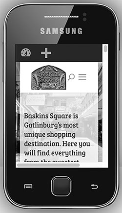
Notice that this website is very usable on this small phone screen. The logo fits into the top of the screen with a dropdown menu next to it for easy navigation. The text on the screen is nice and big and easy to read. There is no side-to-side scrolling.
Bad Mobile Design
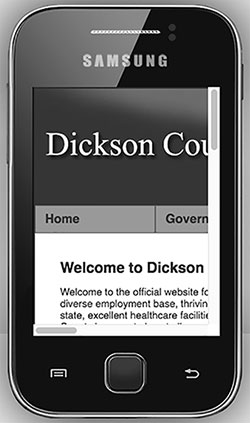
Sorry Dickson County government, but your website looks crappy on this small screen. You can only see a tiny portion of the page and are going to have to scroll to the side several times to read all the way across. To see the different menu options, you will have to scroll sideways as well.